

Recently, I was asked to give a wedding photography referral. While I certainly found some great photographers, what amazed me was the lack of professionalism in terms of developing a website that showcased the photographer’s work in a way that clients could easily follow.
Don’t get me wrong — some web portfolios were spot on. But about 75% of what I saw had major problems. Some were too slow to load. Some had a landing page where it wasn’t clear that you needed to click to see the full website. Some I couldn’t even find a wedding gallery!
These things tend to bother me, especially with my web design background. Here are some key items that need to be taken into account when putting your website portfolio together:
1. Make It Clear
This should really go without saying. Your design and website structure should be easy-to-follow. I should be able to find a wedding gallery in less than five seconds of hitting your homepage. It shouldn’t be buried three levels deep.
Your navigation also needs to be clear. Stay away from using fancy words. Have a page to learn more about you, a gallery heading, your blog, and a contact page. That’s all you need.
Furthermore, if you don’t have a specific emphasis, categorize your images for me. You can either do this by topic or client (if you have some regulars). For instance, Events, Corporate, Food + Drink and Weddings might be your categories.
At the same time, don’t list category after category. Use them broadly and where they make sense. And if you have more than five categories, push them behind a parent heading (Gallery, or Portfolio, for instance).

2. Optimize Your Photos
I don’t want to come to your website and see blurry, grainy images. And at the same time, I don’t want to wait 30 seconds for one photo to load.
Your photos should be optimized for high-resolution, retina screens. Almost any Mac you buy now has a retina screen. Any iPhone or iPad? Same thing. And they’re becoming more and more common on PCs, too.
Here’s a trick I use. In Lightroom, I export all my website photos to the same settings. I choose 2,400 pixels on the long side, and then 70% quality. Every photo I export for the web is a JPEG.
Why? The vast majority of websites aren’t going to be wider than 1,200 pixels wide. With retina screens, you need to double the size of your images for these viewers, hence the 2,400 pixel dimension.
And why not 100% quality? Your users aren’t going to zoom in super close to your images. And changing just 10% of your quality can decrease your photo size by 1 MB, in some cases.
The lower you can get the file size down, the better for your users. It’ll make your photos load faster, and ultimately provide a better experience for your users.
3. Choose a Reliable Platform and Host
Despite my web design experience, I use Squarespace for managing my web portfolio. It’s easy to use, fast and it does a lot of the work for me. There’s a ton of different templates that you can customize to your liking, and it does a great job of showcasing your work.
If you’re an Adobe Creative Cloud subscriber, try out Adobe Portfolio. While not as customizable as Squarespace, this is a great, easy-to-use platform that will get you on the web quickly. The only downside for me with this? There’s no blog option available with it, so you’d have to host that elsewhere.
But there’s a plethora of other solutions out there too, including WordPress and Smugmug.
WordPress is a powerful system (use the .org version and get some professional hosting). A lot of the corporate websites you see out there today use WordPress as a backend, because it has endless possibilities in terms of designs, plugins and more.
Smugmug is a great tool that will not only enable you to showcase your photos in an attractive way, but also has a great built-in commerce and client system. If you do a lot of online sales, you can’t get much better than Smugmug.
There are others out there too, but these are the most common you’ll run across.
Regardless of the platform, you have to choose a host that’s reliable and reasonably speedy. Flywheel is a great option for WordPress sites (that’s all they host), while SiteGround is a great all-around option (it’ll give you e-mail and other services, too).
The rule of thumb here is you get what you pay for. Avoid the $3.99 hosting specials and go with a reliable solution. Mediatemple and Digital Ocean are a few other names, though those are a bit more technical to setup. If you aren’t techie, look for a host that has a live chat option, and one that will migrate a site for you if necessary.

4. Choose a Modern Design
I can’t tell you how many websites I’ve come across that are super cheesy portfolios, with big Papyrus, Comic Sans or Zapfino fonts all over them. Get rid of it. Go simple. Go modern.
Google Fonts is free, and offers a number of modern fonts that will work with your website. Depending on the platform you choose, there’s usually a way to embed these rather easily. Open Sans, Lato, Roboto, Source Sans Pro, Raleway, Roboto Slab, Droid Serif and Quattrocento are a few of my favorites. If you’re using Squarespace, there’s already a plethora of fonts built-in.
Let your photos do the talking. People want to see big images that are easy to navigate back and forth with; don’t choose a design that has your photos at a small size. And, more than anything else, avoid music and sound on your website. It catches people off guard, is often cheesy and you’ll immediately turn anyone off in a business environment.
No matter with route you go in terms of platform, there’s a few things you need to know. For WordPress and other platforms, there are several theme repositories which may be of some help. With Squarespace, you’re going to be restricted to customizing what they offer in terms of templates. With WordPress and various other platforms mentioned above, places like ThemeForest.net are a good place to start. Regardless, with a theme, be sure you’re choosing one that’s relatively up-to-date and has decent reviews.
Your design should be easy to follow and read. Your photos should pop. Avoid harsh-colored backgrounds that take the focus away from your content.
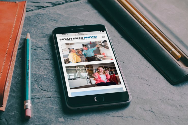
5. Make Your Website Responsive
The iPhone was introduced in 2007. It’s been over eight years! Your website better scale automatically to work on a phone, tablet…you name it. If you don’t have a responsive site and I’m viewing on my mobile device, I’m leaving your site.
And if you have a Flash website, it’s time to join the rest of the world in ditching cheesy animation and slow-loading sites that aren’t supported by every device. If you use Flash, I can’t view that on an iPhone, iPad and even most Android devices. On a computer, Safari doesn’t support it by default, and Chrome has started to turn it off by default as well.
The Bottom Line
Hopefully these five key ingredients will help you along the way to having not only a great-looking, well-performing website, but a website that will also get you more clients.
There are several more things to take into account with your website once you have it setup — writing regular blog posts, selectively choosing your portfolio, being active on social media, installing a search engine optimization plug-in, etc. The possibilities are endless, so be sure to do your research and put time into it!